logo design · 2026

Vistra Biotechlogo

A DNA pattern joined to the Vistra wordmark: a pharma brand that reads as science, stated plainly.

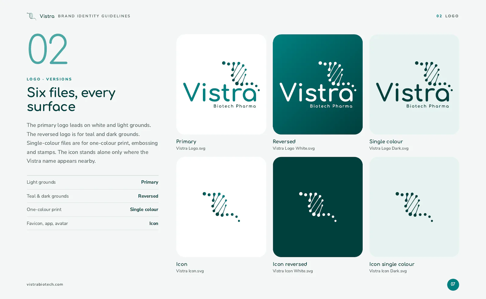
Primary · on light
Reversed · on the brand colour
Vistra Biotech Logo icon
Icon
Vistra Biotech Logo icon, reversed
Icon · reversed
the idea behind it

What the mark says

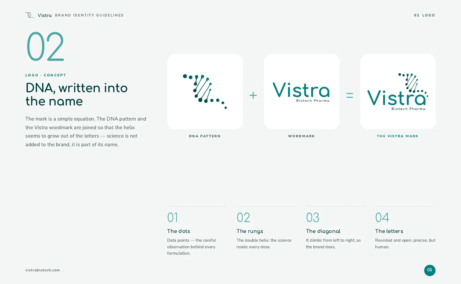
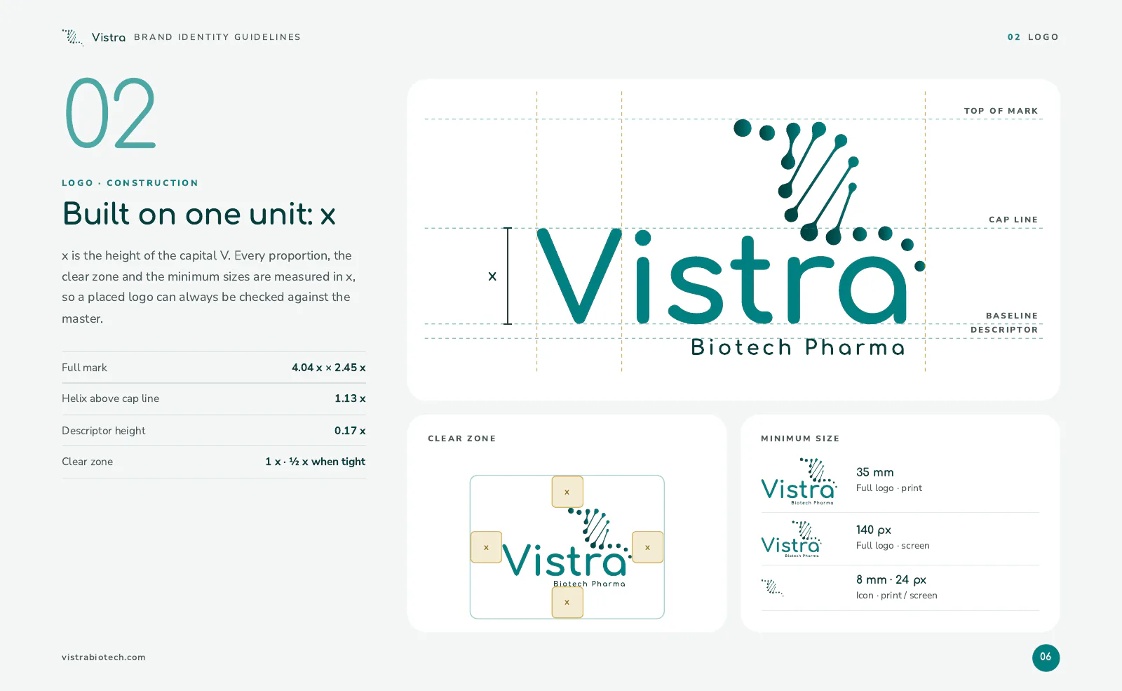
Vistra Biotech Logo: how the mark is put together

A DNA pattern rises out of the Vistra wordmark, joined so that the helix seems to grow out of the letters. Science is not added to the brand; it is part of its name.

  • The dotsData points: the careful observation behind every formulation.
  • The rungsThe double helix: the science inside every dose.
  • The diagonalIt climbs from left to right, as the brand does.

  • The lettersRounded and open: precise, but human.
  • Primary Teal#008080
  • Teal Dark#003F3D
  • Teal Light#4DA8A5
  • Accent Gold#C9A227
from the guide

How it is used

  • Vistra Biotech Logo guide, page 1
  • Vistra Biotech Logo guide, page 2
  • Vistra Biotech Logo guide, page 3
tell us where you want to go

Your mark next?

Tell us where you are today. We will reply within 48 hours with what we would do first, and what it would take. No pitch deck, no obligation.

  • Free first review of your website and marketing
  • A clear plan, even if you do it yourself
  • Straight answers from the people who build it
Keval Shera
you will hear back from meKeval SheraCo-founder & CEO